How to Choose Paint Colours to Match Furniture and Décor

Picking a paint colour feels simple until you get the swatch home and hold it next to your couch. Suddenly that "perfect" grey looks a little too blue, or the warm beige clashes with your walnut coffee table. The paint colour that works best is the one chosen with your existing furniture, flooring, and light in mind, not picked in isolation from a fan deck. This is the exact situation we walk into on painting jobs across Ottawa every week, and it is one of the most common questions homeowners ask before booking a colour consultation.
Choosing paint colours to match your furniture and décor comes down to a few practical steps: identify the pieces you're keeping, figure out their undertones, and test real samples in your own light before committing to a gallon. Ottawa homes get a wide range of light throughout the year, from bright summer afternoons to grey winter mornings, and that shift can change how a colour reads on your wall. Get the groundwork right and the rest of the process feels a lot less like guesswork.
This guide covers how to read your fixed finishes, spot warm and cool undertones, and build a palette that works with the furniture you already own, whether that's a leather sectional, a walnut dining set, or a mix of pieces collected over the years.
Start With Your Anchor Pieces and Fixed Finishes
Your paint colour choice should follow your furniture, not the other way around. Before you open a single paint can, look at what's staying in the room: the couch, the rug, the curtains, and any large pieces you're not planning to replace. These items set the tone for everything else, and the wall colour needs to work around them.
Take Stock of the Couch, Rugs, Curtains, and Artwork
Start with the biggest, most colourful item in the room. If your couch is a deep navy or your rug has rust and gold tones, those colours become your starting palette whether you planned it or not.
Look closely at patterns in curtains or artwork too. A piece with several colours often has one dominant shade and a few supporting ones, and that dominant shade is a strong candidate to echo somewhere in your wall colour or trim.
Factor in Flooring, Tiles, and Existing Wall Colours
Flooring and tile are permanent parts of the room, so they need to guide your colour choice. Wood flooring with warm honey tones pairs more easily with warm wall colours, while cooler grey-toned floors lean toward cooler paint choices.
Dark wood furniture, like walnut pieces, tends to have red or purple undertones, while white or neutral furniture gives you more flexibility. If your home has any existing wall colour you're keeping in an adjoining room, factor that in too so the transition between spaces feels planned rather than accidental. This step alone solves a lot of the guesswork, according to a practical guide on matching paint with existing furniture.
Identify Undertones Before Choosing a Hue
Undertones decide whether a paint colour feels warm or cool once it's on your wall, and getting this wrong is the single biggest reason a colour looks "off" after painting. Every colour, even a plain white or grey, carries a hidden undertone of yellow, pink, green, or blue that shows up more once the paint dries and the light hits it.
How Warm and Cool Undertones Affect Neutrals
Neutrals are never truly neutral. A beige can lean warm and golden or shift toward a greige with grey undertones. A "white" paint can read as a warm white, a creamy white, or a crisp, almost blue-white depending on its base.
Grey works the same way. Warm grey has a beige or brown undercurrent, while cool grey leans toward blue or lavender. If your furniture and décor lean warm (think walnut furniture, terracotta accents, or warm wood floors), a warm grey or greige on the walls feels far more cohesive than a cool grey, which can make the room feel mismatched even if both colours are technically "grey." As explained in this breakdown of how undertones affect paint choices, the undertone matters more than the name on the paint chip.
Choose a Balanced Starting Point for Mixed Décor
If your furniture and décor include a mix of warm and cool pieces, a balanced neutral gives you the most flexibility. Look for a paint labelled as a "true neutral" or one with a very subtle undertone rather than a strong warm or cool lean.
This approach works well in Ottawa homes where furniture has been collected over several years rather than bought as a matching set. A slightly warm off-white or a soft warm grey tends to flatter most wood tones and upholstery colours without pulling too hard in one direction, a point echoed in this guide to identifying undertones before picking a colour.

Build a Balanced Colour Palette
A room feels put together when one colour clearly leads, a second colour supports it, and a third adds a small pop of interest. Trying to give every colour equal weight is what makes a room feel busy or unfinished, even when each individual colour is nice on its own.
Use the 60-30-10 Rule to Assign Colour Roles
The 60-30-10 rule breaks a room's palette into three simple roles. Your dominant colour, usually the wall colour, covers about 60% of the room. Your secondary colour, often furniture or large textiles, covers about 30%. Your accent colour, used in pillows, art, or small décor, makes up the remaining 10%.
This structure, described in this guide to building a whole-home colour palette, gives you a clear framework instead of guessing how much of each colour to use. It also explains why a bold accent wall or bright throw pillow can work in a room full of neutrals: it's playing its proper 10% role, not competing for the spotlight.
Should You Match or Contrast Your Furniture?
You don't need to match your wall colour to your furniture exactly, and in most cases, a soft contrast looks better than a close match. Pairing a wall colour that's a few shades lighter or darker than your furniture, or one that sits on the opposite side of the colour wheel in a muted way, adds depth without looking like a mistake.
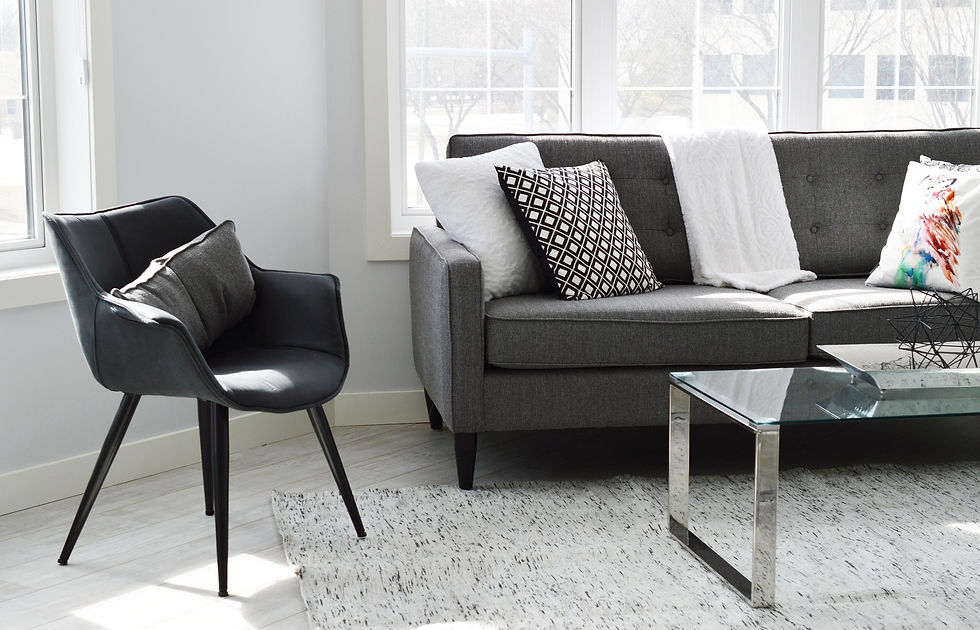
For example, a charcoal sofa against a soft sage green wall creates gentle contrast rather than a jarring one. A deep navy accent wall behind a neutral, cream-coloured sofa does the same thing. Both pairings work because they respect the 60-30-10 balance while still giving the room some visual interest.
Wall Colour Pairings That Work With Common Furniture
Certain wall colours consistently work well with certain furniture styles, and knowing these pairings in advance saves a lot of trial and error. Wood tones, leather, upholstery colour, and metal finishes each respond differently to warm versus cool wall colours, and matching the pairing to your specific furniture makes the whole room feel intentional rather than accidental.
Paint Colours for Wood and Leather Pieces
Wood and leather furniture generally look their best against warm or earthy wall colours. Sage green, olive, and terracotta all bring out the warmth in wood tones without competing with them.
Dark wood furniture, including walnut pieces, pairs especially well with warm neutrals or deep, muted colours like olive or a soft charcoal. Lighter wood tones have more flexibility and can handle both warm neutrals and soft blues without looking out of place.
Paint Colours for Neutral and Colourful Upholstery
Neutral upholstery, in beige, grey, or cream, gives you the most room to experiment with bolder wall colours. A neutral couch can sit comfortably in front of a navy, slate blue, or dusty blue wall without feeling overwhelmed.
If your upholstery already carries colour, like a blush accent chair or a navy sofa, let that colour guide your wall choice. A soft, muted version of the same colour family (a dusty blue wall with a navy sofa, for example) tends to look more cohesive than pairing two unrelated bold colours in the same room.
Coordinate Metal Finishes Without Overmatching
Metal finishes don't need to match perfectly to look good together. Gold, brass, silver, chrome, and nickel finishes can mix in the same room as long as one finish is used more than the others, similar to how the 60-30-10 rule applies to colour.
Warm metals like gold and brass tend to pair naturally with warm wall colours and wood tones, while cool metals like chrome and nickel lean better with cooler greys and blues. A little mixing is fine; it's the ratio that keeps the room feeling balanced rather than scattered.
Test Colours in Your Room's Changing Light
Ottawa's light changes a lot throughout the day and across seasons, and that shift can make the same paint colour look completely different depending on when you're standing in the room. A colour that looks perfect at noon in July can look flat and grey on a January morning.
Why Natural Light and Artificial Light Change Paint
North-facing rooms tend to get cooler, flatter light, which can make warm colours look muted and cool colours look even cooler. South-facing rooms get warmer, brighter light throughout the day, which can make colours look more vivid and warm than expected. This pattern is well documented in this guide to how lighting affects paint colour.
Evening light from lamps and overhead fixtures adds another layer, since warm-toned bulbs push colours toward yellow and cooler LED bulbs can push them toward blue. A colour that looks great under daylight might shift once the sun goes down and the lamps come on.
How to Compare Paint Samples Before Committing
Large sample boards beat small paint chips every time. Paint a piece of poster board or a sample swatch at least a foot wide, then move it around the room next to your furniture, your flooring, and your existing trim.
Check the sample at three different times: mid-morning, late afternoon, and after dark with your regular lights on. This step alone catches most of the surprises that show up after a full room gets painted, a point supported by this guide to testing paint colours before committing.
Check Trim, Ceilings, and Nearby Rooms
Your wall colour doesn't exist in isolation from the rest of your home. Hold your sample next to the trim, and check how it reads against the ceiling colour too, since a stark white ceiling can make some wall colours look duller by comparison.
If your home has an open layout, glance into the adjoining room as well. A colour that looks great in isolation can feel disconnected if it clashes with the paint colour just a few steps away.
Choose a Colour That Makes the Whole Room Feel Intentional
The right paint colour makes a room feel like every piece was chosen on purpose, even if your furniture was collected over several years rather than bought all at once. Good colour coordination isn't about finding an exact match for your couch or rug; it's about choosing a wall colour that respects the undertones, wood tones, and fabric colours already in the room.
A little contrast, a clear sense of which colour is leading the room, and a colour tested in your own light at different times of day will get you further than chasing a perfect match on a paint chip.
Letts Paint walks Ottawa homeowners through this exact process during colour consultations, bringing large samples right into the room next to the furniture and finishes that are staying put. That hands-on comparison, done in your own home under your own lighting, is what turns a good guess into a colour you'll be happy with for years.